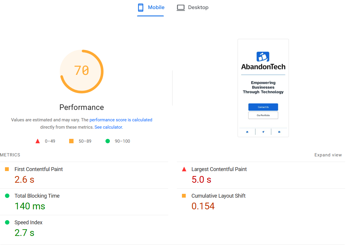
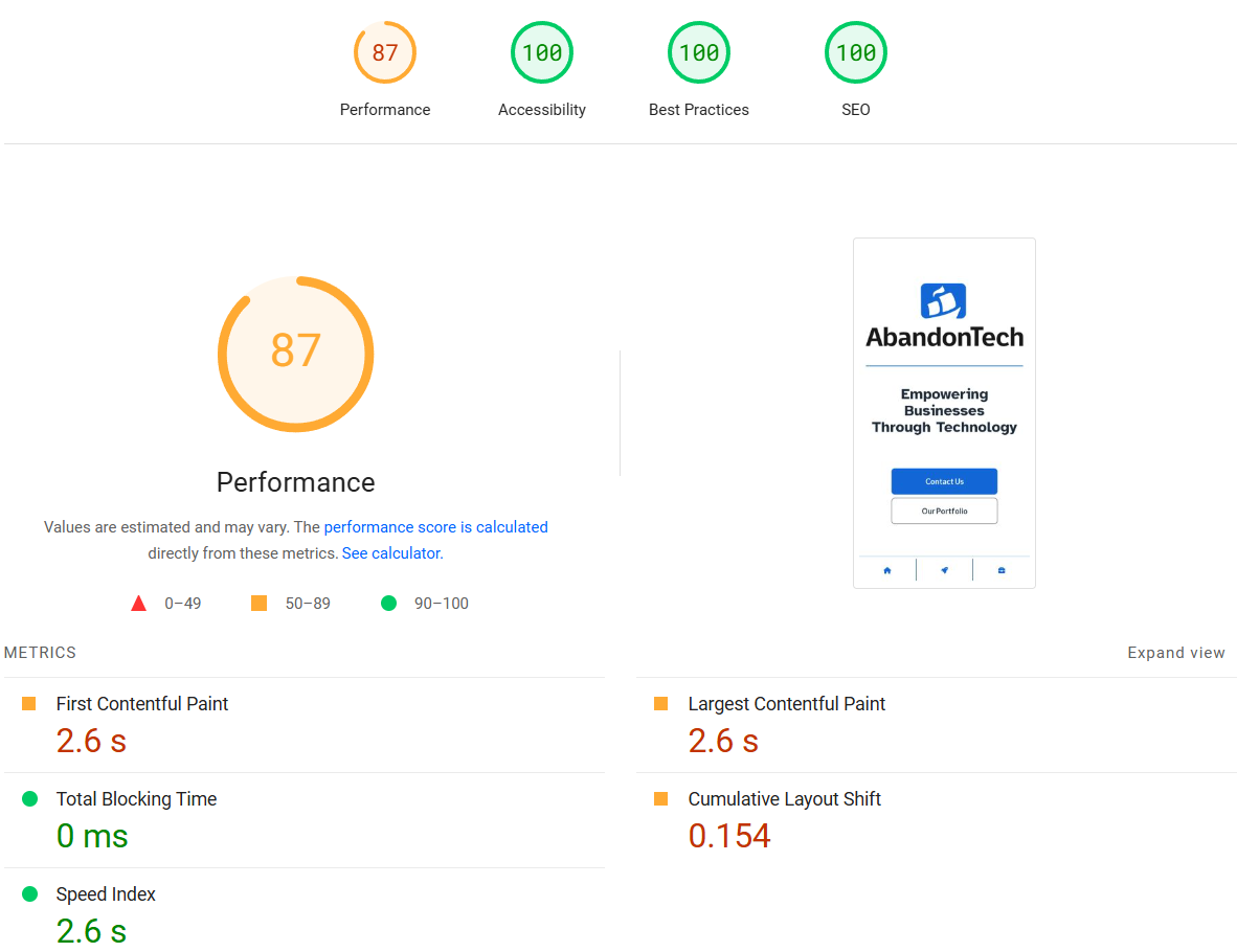
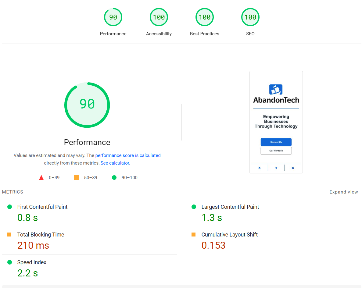
It recently occurred to me that I hadn't run any analysis for SEO on our main website. I finally sat down with my cup of coffee and generated a few benchmarks using a couple of online lighthouse tools as well as lighthouse in my browser's dev tools.
The source code for this website is found on Github, if you would like to check it out or follow along to see how these changes were made.
Research Phase
Immediately, we had some problems. Accessibility and performance were not within acceptable limits. Typically, I would like to see these scores upwards of 90% and then I can nitpick and hyper-optimize from there. Though this time was different. We missed quite a few important accessibility details, which is arguably the most important aspect of these benchmarks. It is of the upmost importance that we fix these accessibility issues. Luckily, the solutions for accessibility problems tend to be straightforward and well-documented when compared to other issues we may find. However; the thing that caught my eye was how atrocious our performance score actually was.
The two online tools I enjoy using are Lighthouse-Metrics and PageSpeed Insights. Using online tools like these should offer a more consistent environment than local dev tools when creating benchmarks like these.
Resolving Issues: Accessibility

As I said earlier, accessibility issues tend to be very straight forward. We use Nuxt for this application. This framework does a lot of heavy lifting when it comes to SEO and performance and warning me when I make mistakes. This contributed to me overlooking some obvious places to improve the accessibility on our site as I became overly reliant on the warnings generated by the framework. As expected, the first fix for accessibility was quite simple--specify the lang for the site. This was as easy as adding the language to the head element for the app.
The second issue to resolve is one that I really should not have missed. Alt attributes for images is one of the most basic and essential accessibility features you can include. I only had to search the application for all of our images and ensure we included accurate, clear, and concise alt text for all of image elements. This was all done in this single PR without many changes.
The final issue to resolve was one that I do not often think about. In hindsight it was a bit obvious, but I had completely overlooked it. We use Font Awesome icons as the content for our links in some places. If icons are used as links, then there is no text associated with that link and a screen reader will not be able to accurately inform the user what each link is for. The main culprits were the links in our footer as they are simply icons with no text.

The solution here was still fairly straight forward. The results from Lighthouse tell us exactly how to fix our issues. We can add the aria-label attribute on our links to give screen readers a description of the purpose of the links.
And with those three changes, we have obtained a 100/100 accessibility score. It is worth noting here that these scores are not a guarantee that the website is accessible or even good. It is always worth getting peer reviews and feedback while also considering all the different ways you can improve readability and accessibility regardless of what these scores might say.

Resolving Issues: Performance
Troubleshooting performance problems can be an entirely different beast. Tracking down the sources of these issues can sometimes prove complex and difficult. I was not prepared for how much time I would commit to finding the root source of our pain points.
For performance debugging I opted to use PageSpeed Insights since it offers more detailed reports than the Lighthouse-metrics site. Our specific results can be found here.

Our biggest problem was that extremely long Largest Contentful Paint. Ideally, we would be able to observe and measure these performance issues live on our website, but because were min-maxing our SEO metrics so most of these "performance issues" were not visible or noticeable in a meaningful way when browsing the site. This made troubleshooting difficult and not at all straight-forward. I had a few areas that I was suspicious of. We use SVGs for all of our images and I was concerned this could be hindering performance while the browser rendered the images. To disprove this theory, I converted these images to webp format and deployed this change. The new benchmarks showed essentially no improvements.
We knew that our other libraries, such as Tailwind and DaisyUI, were likely not the problem as we have used these frameworks with Nuxt before without the same issues. My next guess was that it could be due to our custom fonts loading. We removed our custom fonts and deployed the change, yet there were still no improvements.
As a last-ditch effort to find these problems I began doing a sort of binary search by removing chunks of installed libraries at a time. I started with libraries I was most suspicious of, then worked my way through. By now I am using lighthouse in my local dev tools to get more real-time updates for my changes. I was not having much luck with the libraries, so I finally just deleted all of them. Sure enough, this worked. According to Lighthouse, the performance issues were gone. So, one-by-one I began adding external libraries back to the project. Finally, we had the source of our problem. It was the library we were using for Font Awesome with Vue--Fortawesome.
To this day I am unsure exactly what was misbehaving with this library, but removing it gave us a huge boost in performance metrics. We replaced all Fortawesome icon components with the SVGs provided by Font Awesome and our problems melted away. This was a big win, but it was not quite enough since we still had some small issues to sort out.

The remaining issues were quite a bit more straight-forward.

I mostly fixed the large layout shifts by preloading the fonts. This ensured that the fonts are loaded before the page renders, thus preventing the layout from moving around after the page has rendered and when the fonts are loaded in at some later time. At this time, I also added lazy loading to all the images on the home page. Sadly, this is a bit anti-climactic, but that pretty much fixed the remainder of our issues. We still have some minor improvements we can make to prevent the layout of the page from shifting after rendering, but overall, I am satisfied with the outcome. We were able to improve our Lighthouse performance rating from a 70% to a 90% with relatively minimal changes.

The additional recommendations for improvements can be found in our final Lighthouse report.
Lessons Learned
My biggest takeaway from this adventure is to better plan what metrics we care about. Most of the time spent debugging our performance metric issues would have been saved if we had been monitoring this from the get-go.
This also served as an important reminder to continue considering accessibility features while I develop. I have been making websites for so long that I often forget to check my work for some of the most basic and important accessibility features, instead relying on my "instincts" to catch the more obvious mistakes (such as text contrast, and excessive motion/animated elements).
Going Forward
Moving forward we plan to include Lighthouse metrics as part of our pipelines. We should have been monitoring our SEO stats from the start to prevent creating an issue like this. Now that time has been invested in improving our SEO, it is important to prevent regressions by including this in our build checks.
As a personal goal, I aim to better consider accessibility as a priority. I will continue to use Lighthouse to check my work, but it is always important to study up and become more informed to prevent issues like this in the first place.


Member discussion: